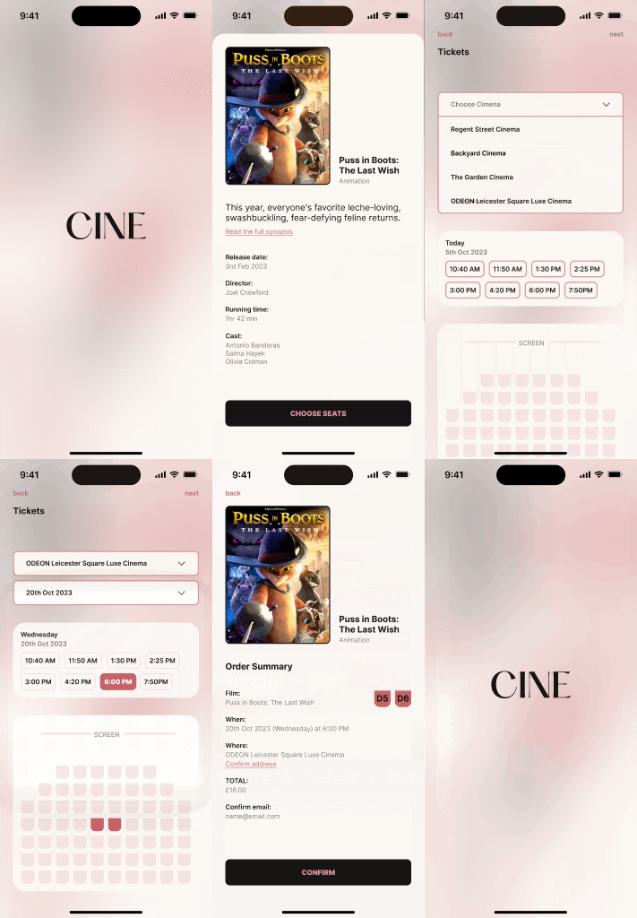
A nostalgic movie ticket booking system.
Cine
The goal here was to create a movie ticket buying flow with low-fidelity wireframes in mobile, considering the small screen size as one of the constraints.
Initially, this should be basic and simple, not spending too much time on typography, color, style, or imagery. It was important to focus on the layout and functionality first.
ROLE: UI Designer
TIME: 1 week
Project objectives
Buying movie tickets can be a cumbersome process due to issues like limited showtimes, sold-out shows, long lines, poor seat selection, and technical difficulties.
Users need a streamlined, user-friendly platform that simplifies the ticket purchasing process from movie selection to final purchase.
So, the main goal was to create a seamless flow where users could find available movies, choose the date, time, and seats, and finally purchase the ticket. To enhance user convenience, the system allows users to first select a movie and then find cinemas offering it based on their location.
The objectives for this
After a desk research, I found that I could do:
Simplify the user journey.
Enhance user convenience by allowing movie selection first, followed by location-based cinema availability.
Ensure a smooth and intuitive user experience with clear steps for date, time, and seat selection.
Incorporate user-friendly features such as location services, easy payment options, and digital ticketing.
And the steps defined to work on were:
Screen 1: List of movies playing/ current releases
Screen 2: Details screen of the movie
Screen 3: Select seats
Screen 4: Payment information
Screen 5: Confirmation
Styling
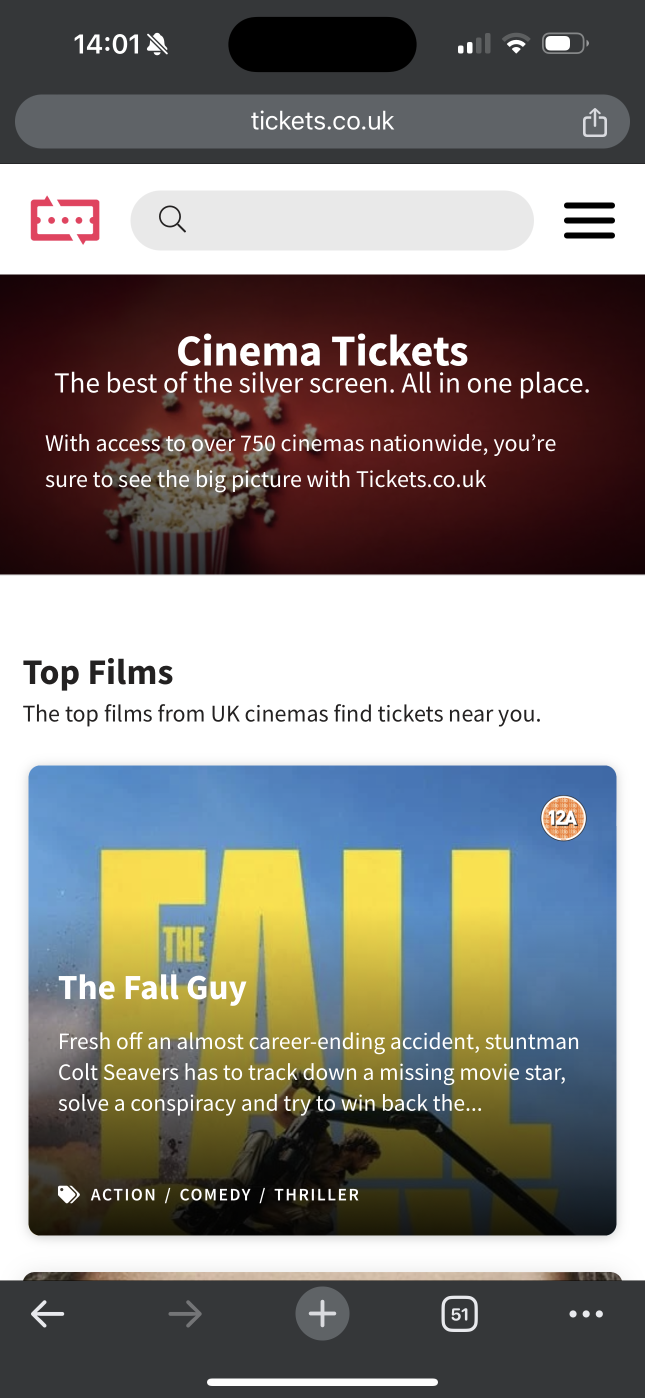
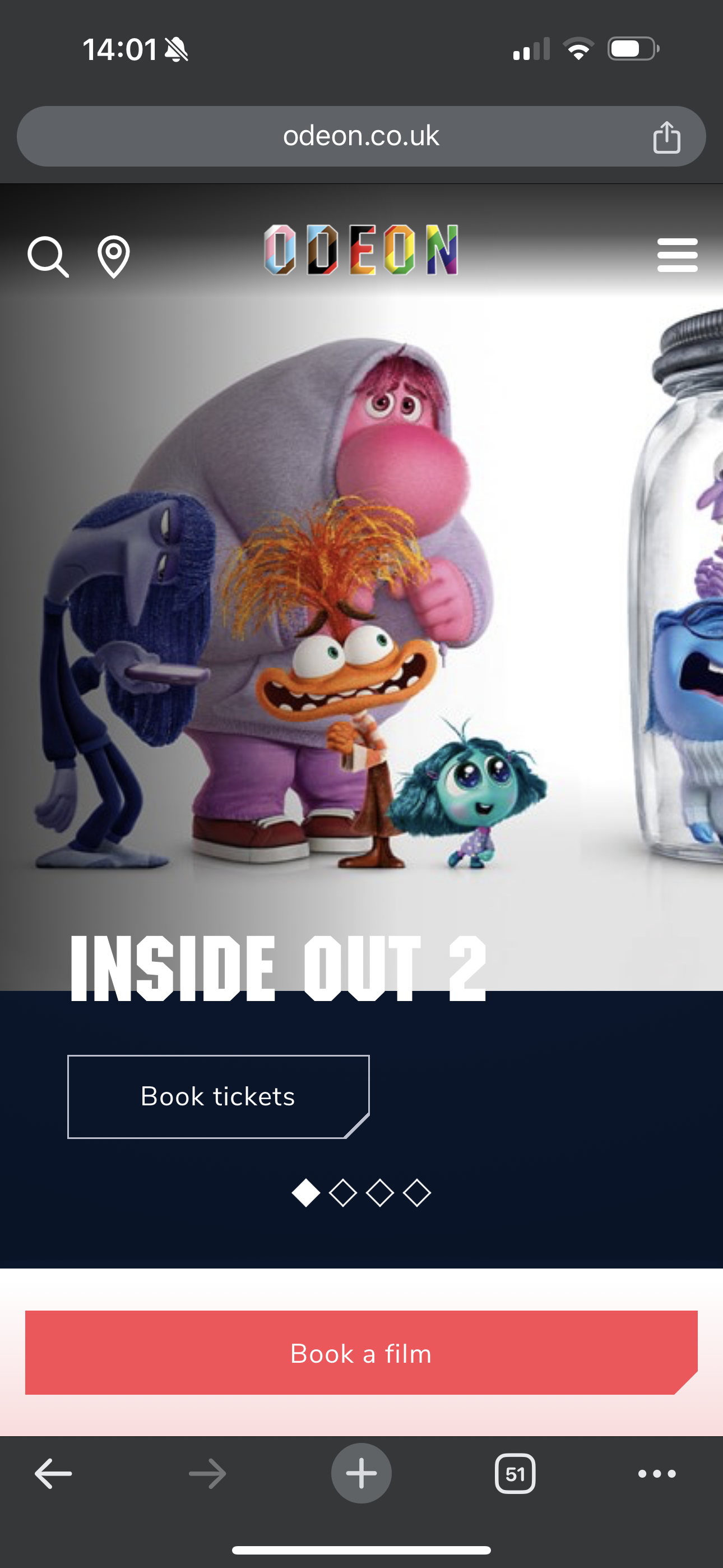
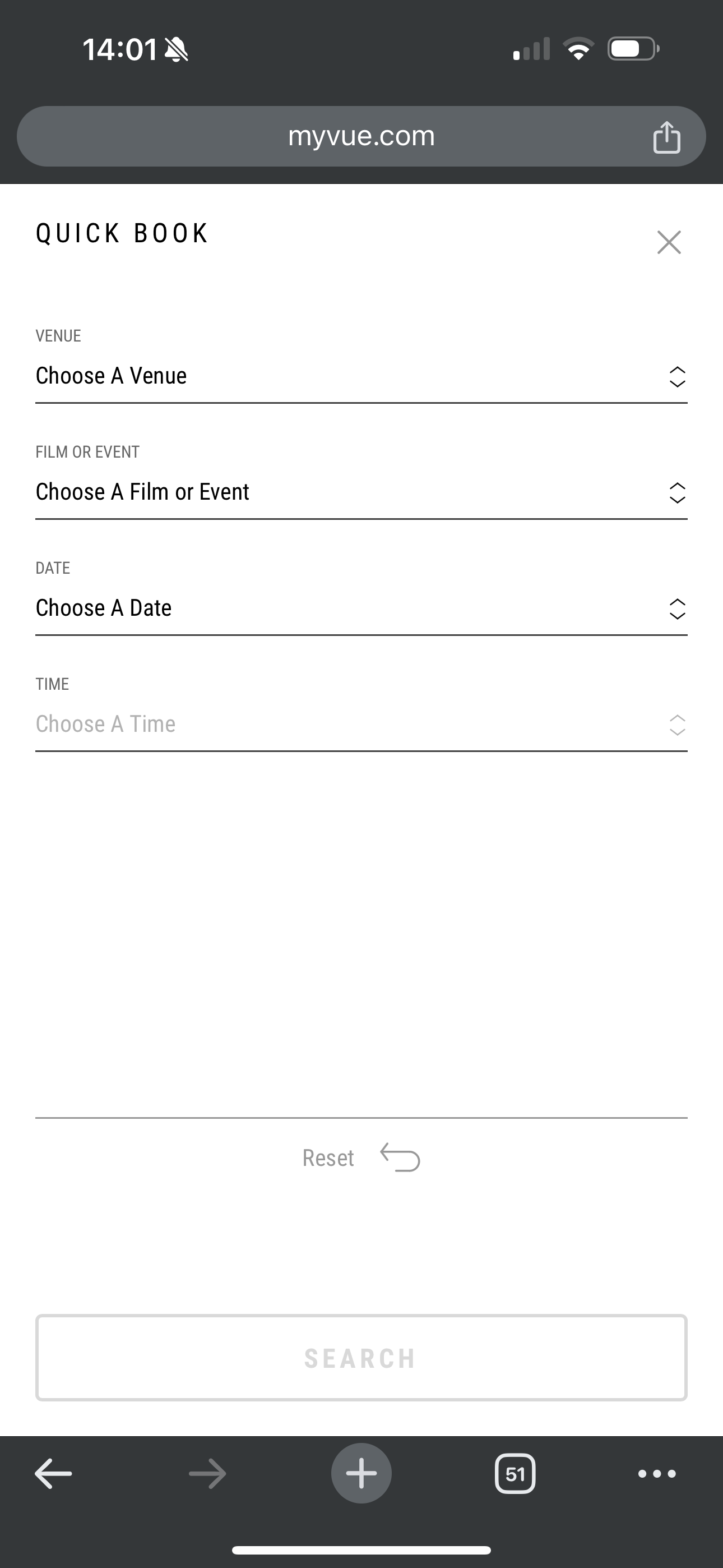
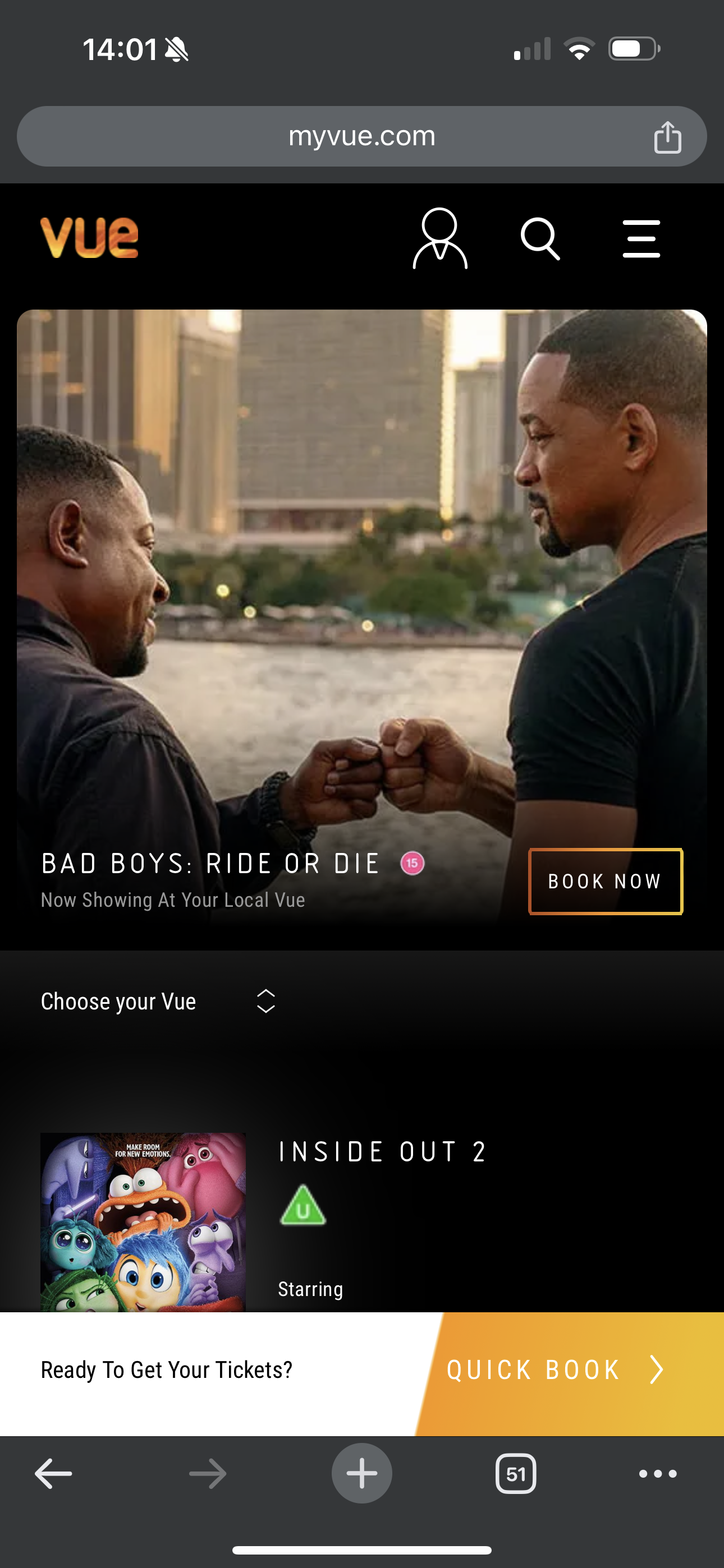
I did a quick research on what is on the market, and I could see that they usually use a dark/ black background, bold with the image of the movie as the main focus.
For my vision to stand out
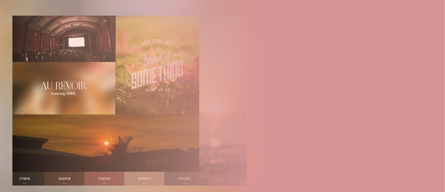
For this, I started with a mood board to help me visually have the feeling for the project. I wanted a basic feeling with a nostalgic and warm vibe to make it stand out from the regular cinema apps which can be very dark and bold.
Also, my goal was to make the User Interface layout clean and intuitive and maintain visual consistency across all screens.

The design
If you would like to see all the screens, go to this link: layout
Takeways
Designing a movie ticket purchase flow for mobile that would stand out, using soft and warm colors instead of the conventional dark and bold scheme, was an interesting challenge. It required drawing inspiration from non-traditional sources and ensuring a balance between aesthetic appeal and usability.
Finding the right colors to create a soft visual experience while maintaining enough contrast for accessibility was crucial. This project was engaging and rewarding to work on, offering a fresh perspective on how a movie ticket booking system can be designed.


